May 27th, 2026
Improved
CONTROL PANEL
APP

Template Updates: redesign and conditions up to 3 levels
We’ve redesigned the Templates tool to make it more powerful, flexible, and easier to use.
You can now create structures with up to three levels (item > subitem > sub-subitem) and add conditions to subitems, allowing you to build more advanced workflows without losing clarity.
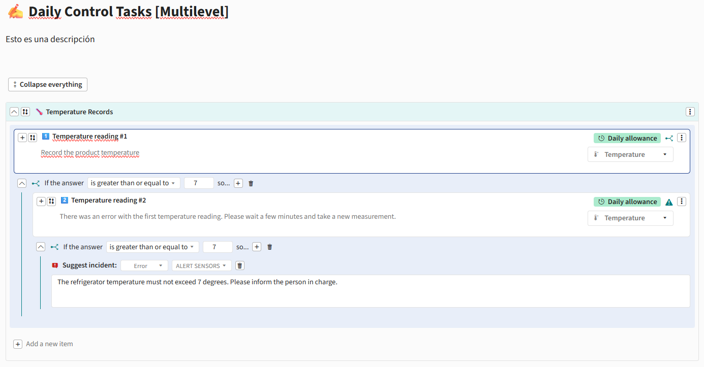
✨ New capabilities
Support for up to 3 levels in Template structures:
Items
Subitems
Sub-subitems
Conditions are now also available in subitems
Ability to create dynamic workflows by displaying elements based on selected answers
New, more agile and intuitive flow for adding elements
“Collapse all” button to improve navigation in large Templates
⚙️ Configuration and behavior
Subitems automatically inherit part of the parent item configuration
Settings such as periodicity are automatically applied to associated subitems
Validations to ensure compatible structures and prevent unsupported configurations
Automatic restrictions for item types that do not support subitems
Validation of active tools before allowing links or associations
🎨 Design and user experience improvements
Redesigned forms for:
Alerts
Incidents
Action plans
Notifications
Improved creation and editing of items and sections
Visual adjustments in Control Panel, App, and reports
Clearer and more organized navigation in complex structures
Improved management of large Templates through section collapsing
CONTROL PANEL
APP
April 16th, 2026
Improved
CONTROL PANEL
APP

(1) Improved chart visualization
The chart has been enhanced by adding a dashed line (- - - -) to indicate periods where no real measurements are available and the displayed value is an approximation.
Additionally, the chart legend now clearly shows product temperature, estimated value (in grey), ambient temperature

APP
CP
Improvements based on your feedback
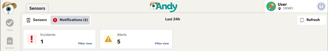
KPI clarity has been improved by renaming “Alerts” and “Incidents” to “With alerts” and “With incidents”, enabling a more direct and intuitive interpretation of the displayed data.

The notifications counter has also been updated to show the total number of alerts and incidents, rather than the number of affected sensors.
APP
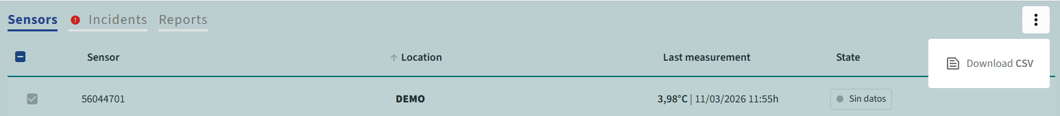
CSV Report Downloads
You can now download reports in CSV format directly from the Control Panel
CP
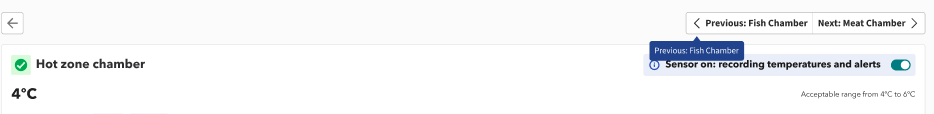
Pagination in sensor details
Navigate between sensors directly from the detail view using the new previous and next controls, without leaving the page.
March 4th, 2026
Improved
CONTROL PANEL
APP

Sensor Card Overview
Refined the data presentation in the Sensors view for better usability
📊 New KPI View on the Home Screen
When opening the app, you will now see the KPI view directly on the Home screen.
This view allows you to monitor and manage your sensors at a glance, giving you quick access to the most relevant information.
APP
🕒 Sensor Power-Off History
A new power-off history log is now available for each sensor.
This log can be accessed from both the Control Panel and the App, making it easier to track events and identify potential issues.
Additionally, the terminology has been updated: sensors previously labeled as "powered off" are now referred to as "muted".
APP
Control Panel
February 11th, 2026
CONTROL PANEL
APP

Bringing Action Plan and Sensors to the Next Level 🚀
We’ve prepared one of the biggest updates to Andy so far. It includes major improvements to the Action Plan and Sensors, making them more powerful, flexible, and capable of creating smarter workflows.
(1) Improvements to the Action Plan
The Action Plan experience has been completely redesigned to enhance the visibility, management, and tracking of action plans generated from audits, making both the tool and the overall experience more consistent, intuitive, and efficient.
🟢 Changes in the Control Panel (CP)
📆 Deadline

Set a timeframe to complete action plans once the audit has been completed.
Andy automatically calculates the deadline and displays it in the app, helping you stay on track.
⭐ Custom Status

In Customization, you can now create and manage Action Plan statuses, tailoring them to your workflow and brand processes.
📋 New Supervision Table

Navigate between audits and action plans, now on separate pages, for a better overview and easier management.
🔹 Audits
A new column has been added to the table with the unique ID for each audit, making it easier to identify and distinguish between different audits.
In the Action Plans column, you can now see a full breakdown of how many action plans are associated with each audit, grouped by status: 🟢 Completed; 🟡 In Progress; 🔴 Open; ⚪ Other custom statuses.
The report provides a quick summary of non-conformities generated during the audit.
🔹 Action Plan (new)
In the new view, you can:
Easily view and manage all generated action plans.
Use filters to customize your view and track progress.
See that each action plan is linked to the ID of the audit that generated it.
🛡 Permission Management
Remember, you can already control who can view and manage action plans:

If the template has no management permissions configured: any user with access can freely manage audits and action plans.
If you set role-based permissions:
View: can only view and create checklists; cannot change statuses or respond to items.
Edit: can respond to items and change statuses, but cannot reopen Completed plans.
Manage: can do everything, including reopening Completed plans, unless they are locked by the deadline.
💡 This reminder helps ensure that permissions are set according to your team’s needs.
Control Panel
🟢 App Updates
⚡ Separate views for Audits and Action Plans

Audits and action plans now have separate pages, making it easier to track, manage, and get a clear view of the process.
🔹 Audit
A new column with a unique ID has been added to easily identify and differentiate audits.
In the Action Plans column, you can quickly see the status of each plan associated with the audit:
🔴 Red: Open action plans that have not yet been started.
🟡 Yellow: In progress.
🟢 Green: Completed.
⚪ Gray: Action plans in other custom statuses.
Access to non-conformities has been simplified: when any are detected, Andy shows the count and provides a quick filter to view only those non-conformities. With a single click, you can switch the view and focus on what you need.

🔹 Action Plan
Now you can:
View, edit, and manage action plans.
Easily track progress and deadlines.
APP
(2) Improvements in Sensors
📊 New KPI View on the Home Screen
When opening the app, you will now see the KPI view directly on the Home screen.
This view allows you to monitor and manage your sensors at a glance, giving you quick access to the most relevant information.

APP
🕒 Sensor Power-Off History
A new power-off history log is now available for each sensor.
This log can be accessed from both the Control Panel and the App, making it easier to track events and identify potential issues.

APP
Control Panel
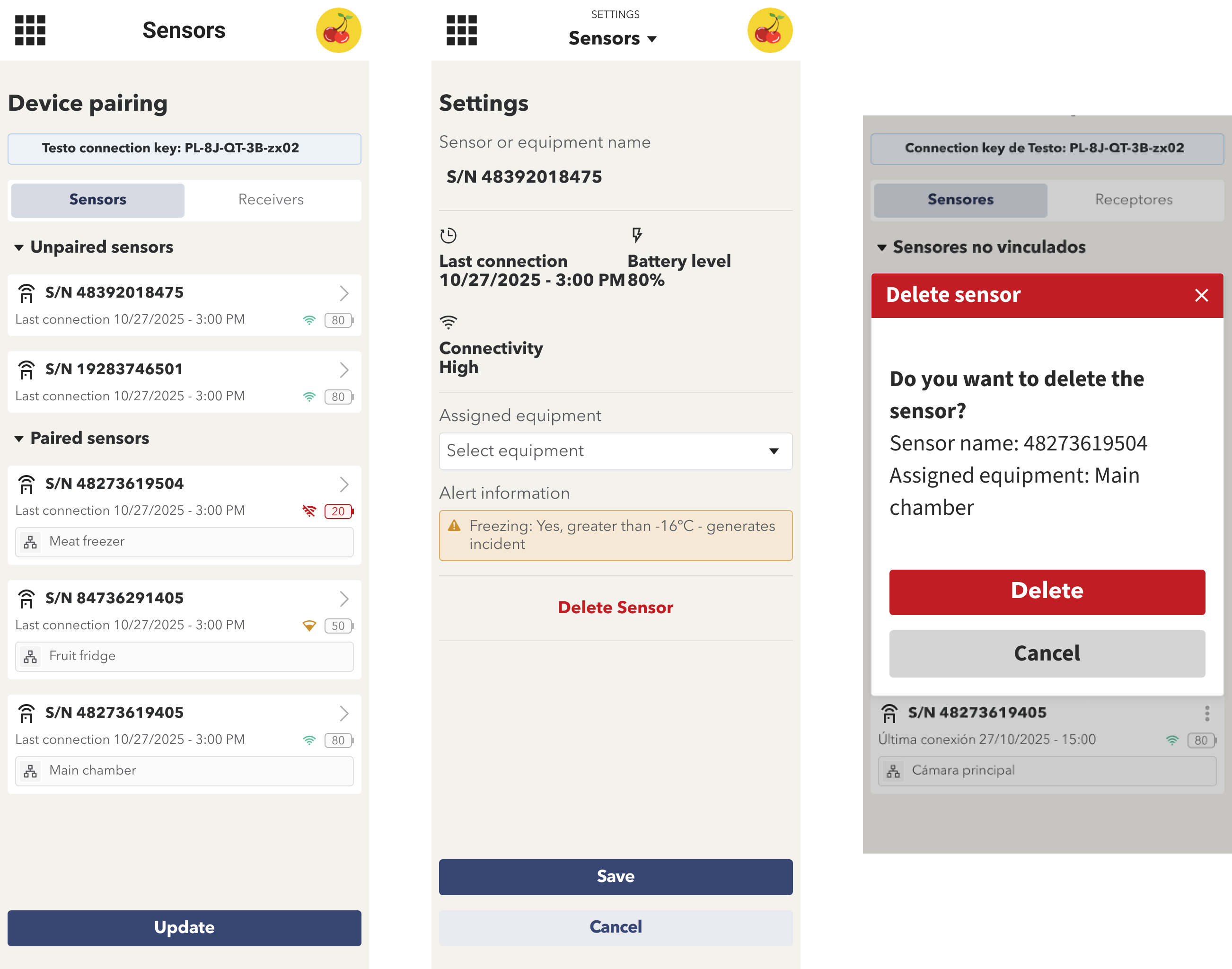
🗑️ New Sensor Removal System (TESTO Devices)
You can now remove TESTO sensors directly from the app settings.
Within the linked sensors section, sensors can be easily unlinked.
Once removed, the pairing process must be completed again to add the sensor back.
APP
December 16th, 2025
CONTROL PANEL
APP

(1) New features in the sensor management tool
Sensor shutdown
A new “Shutdown” option has been added to disable sensor alerts and incidents.
When shutting down a sensor, users are required to provide a reason for the action, ensuring traceability and operational control.


New KPI for shut down sensors
A new KPI card has been added to the main dashboard to display sensors that are currently shut down.
This allows users to quickly identify sensors that may need to be re-enabled, improving monitoring and proactive management.
APP
Sensors in Control Panel
Sensor list by location
A sensor list grouped by location has been added, displaying the current temperature values.
The table uses a new functionality that allows rows to be expanded and collapsed.
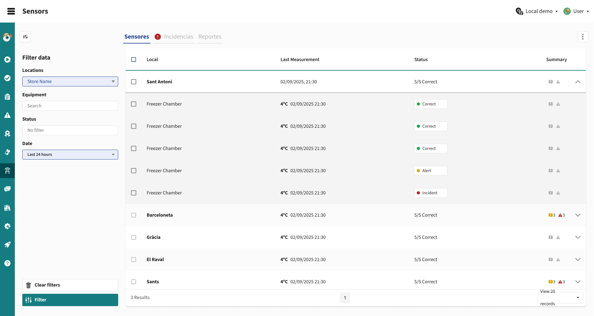
This improvement enables users to:
Quickly locate all sensors associated with each location.
Maintain a simplified and cleaner table structure.
From this list, users can access the individual details of each sensor to review its specific information.
Configuration → Sensors
A new section has been added under Configuration → Sensors.
This view provides a detailed list of sensor devices, making monitoring and management easier.
The table includes the following columns: Location, Equipment, Sensor ID, Battery level, Connection level, Last measurement, Status
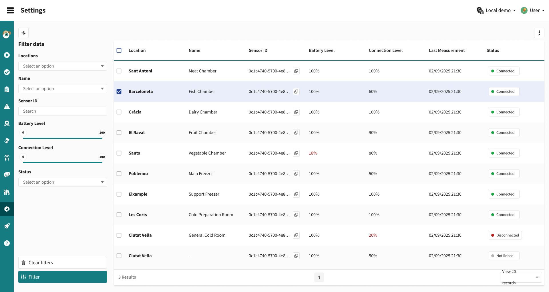
Control Panel
November 18th, 2025
Improved
APP

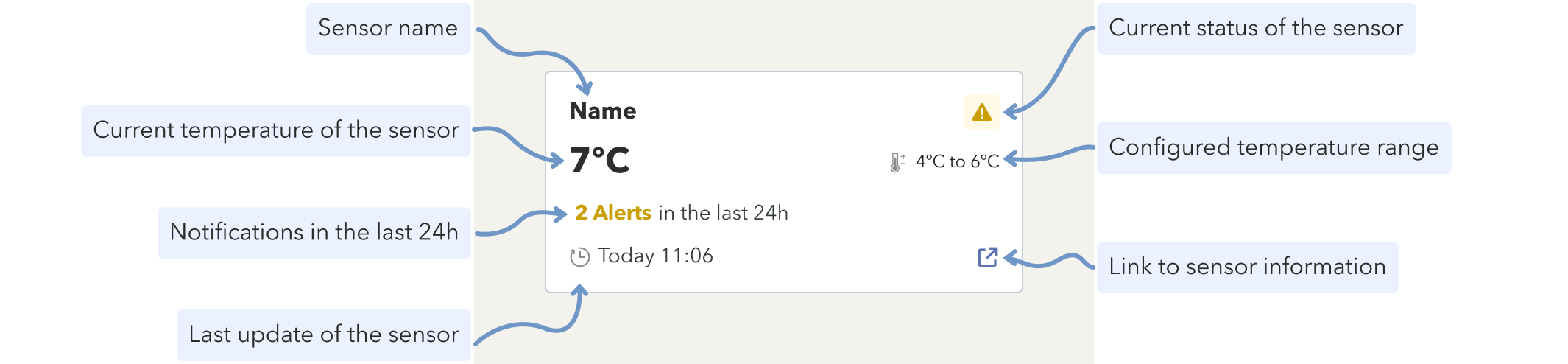
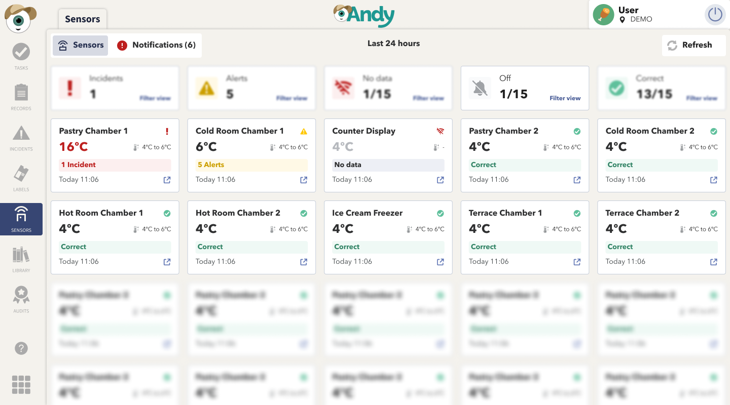
(1) Visual improvements in the sensors tool
The main sensors view has been completely redesigned to provide an immediate reading of the system’s status.
All existing functionalities have been maintained, but the experience is now much clearer, faster, and more intuitive.

Main changes in the traffic-light view
Each sensor is now displayed as an individual card, showing its status through color coding:
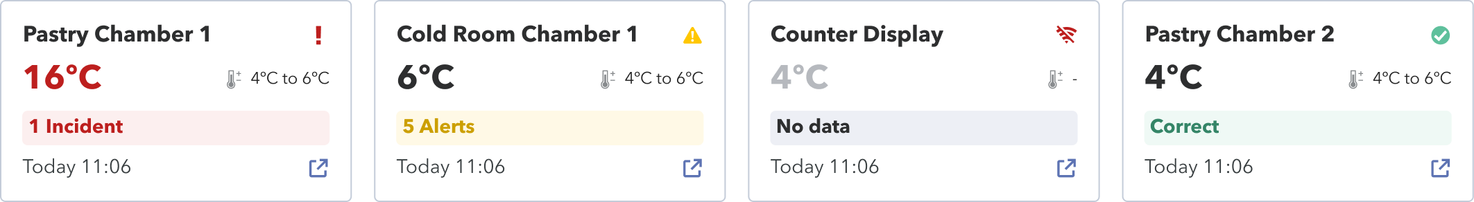
🟢 correct · 🟡 alert · 🔴 incident · ⚪ no data
Each card includes:
Sensor name
Current temperature and expected range
Summary status
Visual status icons (✔, ⚠, ❗, 📶)
Timestamp of the last measurement
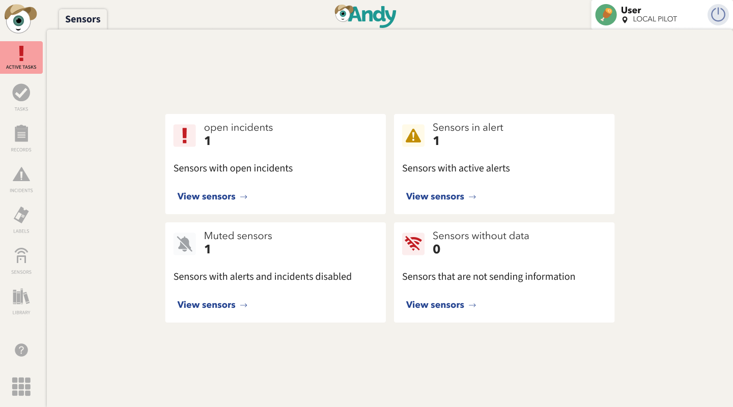
📊 New global counters
A set of indicators has been added at the top to provide a quick overview.
They are also interactive: tapping any of them filters the view to show only the corresponding sensors.

🧭 New tab navigation
![Grabación de pantalla 2025-12-15 083636.mp4 [video-to-gif output image]](https://686fb32dfaa9374ef4d97c66.featurebase-attachments.com/c/changelog/6915e1d9a3099e649f449197/019b20f5-c5cb-70ae-b92f-929846983a45/b64u-MDE5YjIwZjUtYzVjYi03MGFlLWI5MmYtOTI5NzYwNjcxNjNk.gif?X-Amz-Expires=3600&X-Amz-Date=20260612T220000Z&X-Amz-Algorithm=AWS4-HMAC-SHA256&X-Amz-Credential=DO801TYC4FCVNNEKURKM%2F20260612%2Ffra1%2Fs3%2Faws4_request&X-Amz-SignedHeaders=host&X-Amz-Signature=d22159cf60451f4baef38b6f36ce820257582d1511966c7ac6bac5ca1fa2fb97)
The old tabs have been replaced with clearer ones and notification icons:
Sensors → Traffic-light view
Notifications → Only active alerts and incidents
This makes it easier to focus directly on what requires immediate attention.
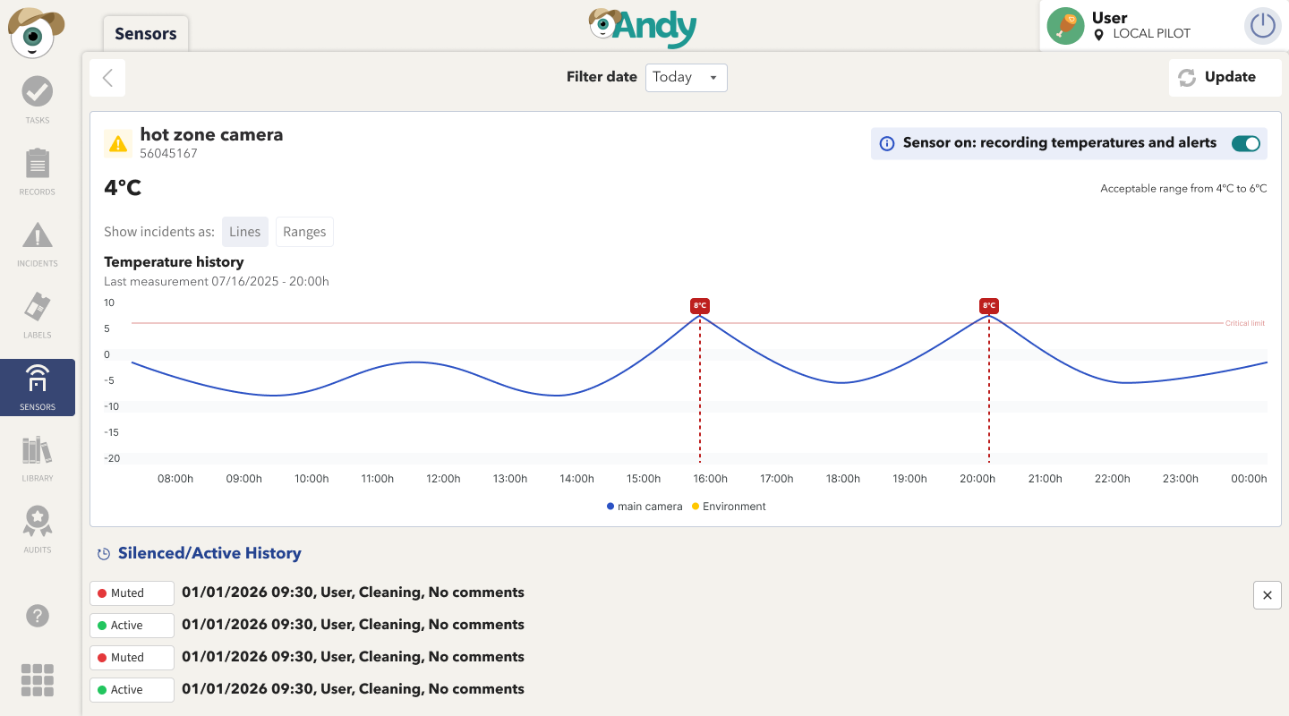
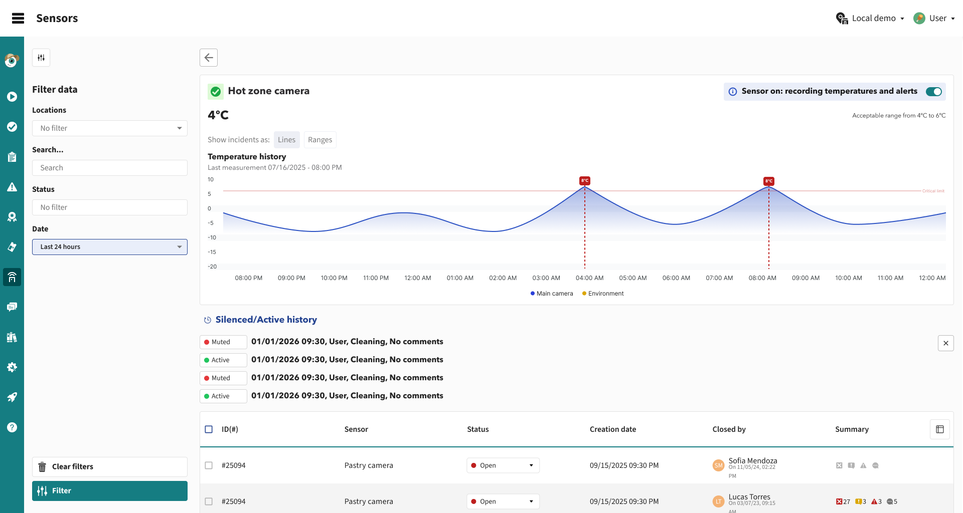
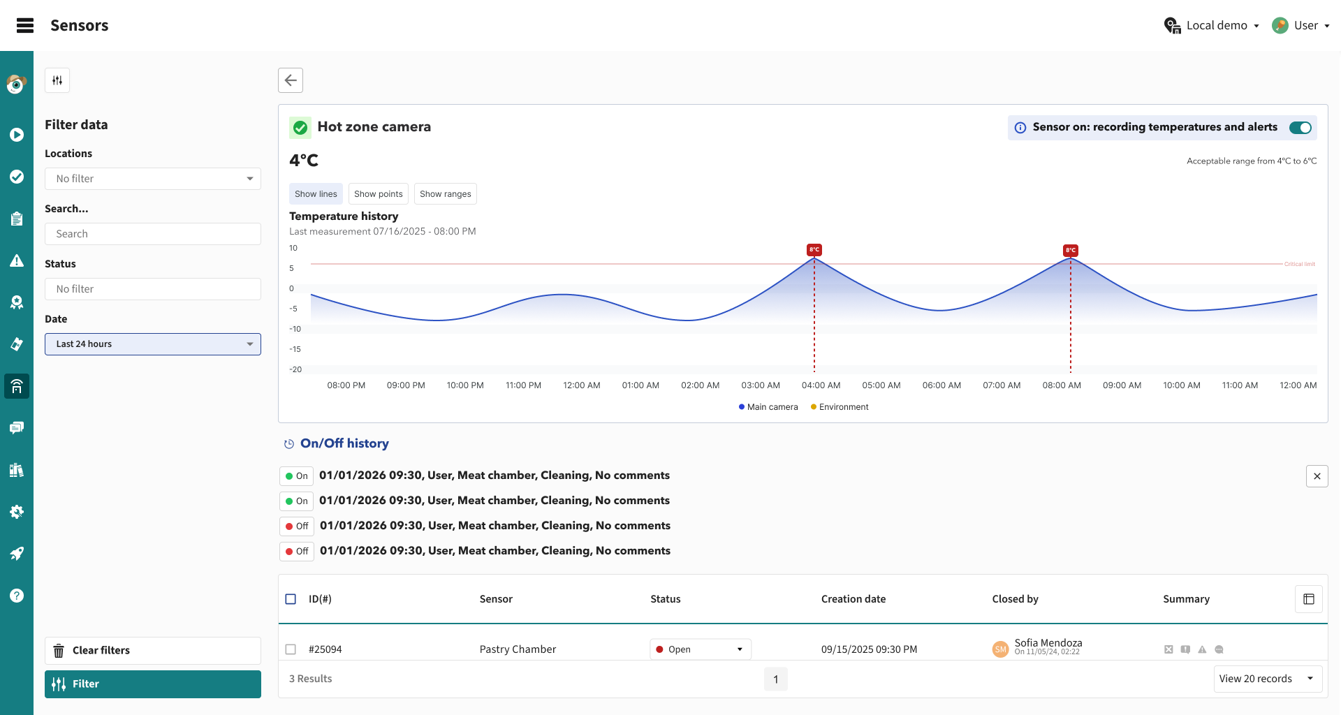
📈 Improved sensor detail chart

The sensor history chart has been updated to offer a clearer and more consistent visual representation.
The chart color now adapts to the sensor’s current state.
Existing tabs are preserved, and an additional one is included (Alerts, Incidents, and Open Incidents), showing both historical alerts and active incidents.
New chart interactions allow switching the view (Show lines, show points, and show ranges).
APP
October 23rd, 2025
New
CONTROL PANEL

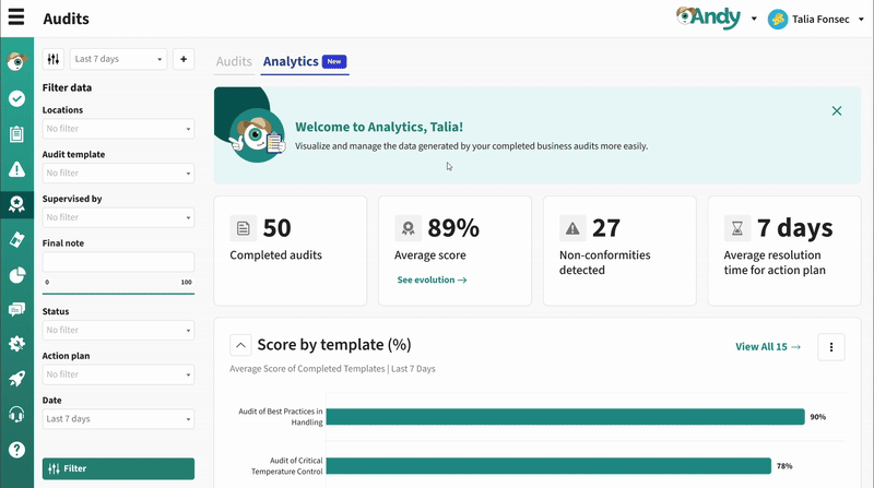
(1) Audits analytics 📊
You can now explore and analyze completed audits through the new Audits Analytics panel. Gain actionable insights on audit compliance, scores, and resolution times. Visualize performance by template, group, or location, track non-conformities, and monitor KPIs with interactive charts and tables.
Control Panel
September 8th, 2025
New
Improved
CONTROL PANEL
APP

(1) Item search in registers 🔍
We’ve added a new way to search and filter records by specific items, making it much easier to find critical data without manually reviewing large volumes of information.
Key improvements:
📝 New item filter in the Records module

🔍 Search by items such as temperatures, checklist responses, or free text

✅ Support for selector/multi-selector items: choose one or multiple options depending on the item configuration

⚠️ Confirmation popup when changing templates with active filters, so users are aware they might lose applied filters

This functionality helps supervisors and auditors save time, verify compliance, and detect errors faster in high-volume operations
Control Panel
(2) Printers in CP 🖨️
You can now view and manage printers across all your locations directly from Configuration > Devices in the Control Panel, with filters, statuses, and detailed info for easier fleet management.

Control Panel
(3) Registers in draft 📝
We’ve launched a set of improvements to make it easier to complete and resume long records without losing track of progress:
✅ Section indicators: each section now shows a check when all required fields are complete.

🔽 Collapsible sections: hide completed parts to focus only on what’s pending.

🗂️ Tabs with markers: tabs now indicate whether a section is complete or not.

📊 Progress bar: shows overall completion percentage at the top.

🔍 Section search: available when records have more than 5 sections.

🚀 Auto-focus: records now open directly at the first incomplete section.

📂 Drafts & Completed tabs in the Records table: quickly locate your drafts, with counters and alerts.

💡 All completed records can now be found under the ‘Completed’ tab

APP
July 8th, 2025
New
Improved
CONTROL PANEL
APP

(1) Records: New Analytics Dashboard 📊
You can now view and analyze the data generated by your business records through a new Analytics dashboard. Visualize key performance indicators, download charts, and gain a clear view of records by status, their distribution by location, and much more.

CONTROL PANEL
Related article: How does Analytics work in Records?
(2) Multi-Select Item: Select multiple options at once 📝
We’ve added a new item type that allows you to select more than one option at a time within an audit, record, or task.
Choose multiple options in a single response field
Supports sub-items
Optimized report display
Available in: Audits, Records, and Tasks, both in the APP and the Control Panel
To enable it, go to the selector item’s properties and check Allow selecting more than one option.


CONTROL PANEL
APP
Related article: Selector Format
(3) Issues, Tasks, and Records: Now with email tracking. 📬
We’ve added a new option under the Share button in the Audits, Tasks, and Records tools. You can now send reports directly via email from Andy and track the status of each delivery.
What does this new feature include?
A new option under the Share button alongside “Copy link”
Send directly via email to multiple addresses with a personalized message
Delivery status tracking (Sent/Open) with date and time

CONTROL PANEL
Related article: How can I customise, download and share my reports?
(4) Home: New KPIs on the Dashboard 🪄
To make it easier to track what's pending, we've added new indicators to the home page of the Control Panel. Now, in addition to the percentage of completed tasks and the total number of tasks completed, you can more clearly see how many templates are still pending verification. These indicators will help you better prioritize your actions and maintain greater control over the progress of your activities.

CONTROL PANEL
June 5th, 2025
New
Improved
CONTROL PANEL

(1) Issues: New Analytics Dashboard 📊
You can now view and analyze the data generated by your business records through a new Analytics dashboard. Visualize key performance indicators, download charts, and gain a clear view of records by status, their distribution by location, and much more.

CONTROL PANEL
How does Analytics work?(2) Home dashboard: Download CSV from charts 📊
(2) Audits: Share Reports and View Email History 📤
A new option is now available to share audit reports via email. You can add a personalized message when sending them and track the status of each delivery: you'll know when the email was sent and when it was opened. This email history will be visible to users with role level 7.

CONTROL PANEL
How to share audit reports via email?